Grid layouts are very common today. A grid layout is when you have a set of boxes all next to each other on the same line. There are several ways to achieve it, but the most common is to use the float property and set the width to a percentage value.
What's the issue?
The issue we encounter when using a grid layout using the float technique is that the background of the container seems to disappear.
The following code creates a basic grid layout.
We have this HTML:
<div class="container">
  <div class="box">
    Column 1
  </div>
  <div class="box">
    Column 2
  </div>
  <div class="box">
    Column 3
  </div>
</div>
And this CSS:
.container {
  background-color: #CFC;
}
.box {
  float: left;
  width: 32%;
  margin-left: 2%;
  background-color: #FCC;
  height: 400px;
}
.box:first-child {
  margin-left: 0;
}
The following image shows the result we get from this code:
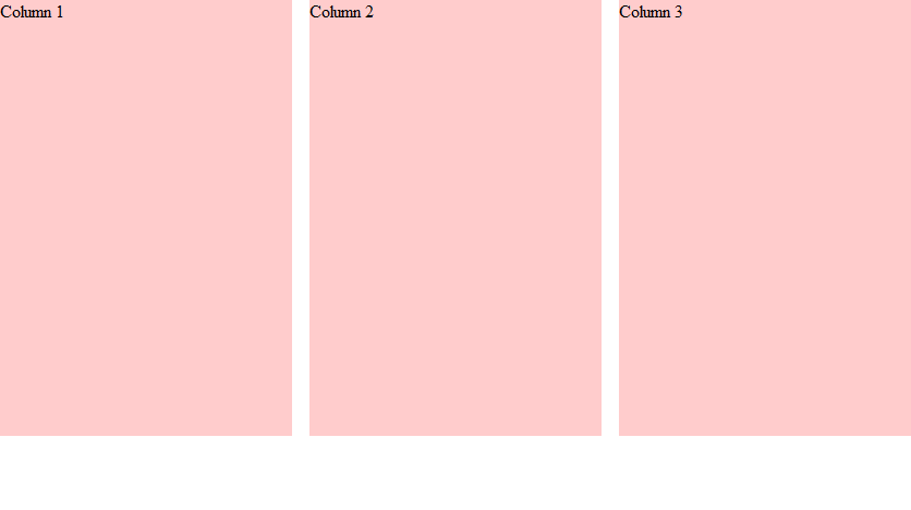
This looks great, we have our three columns with spacing between them, but the background is missing! It's white, but we specified #CFC, a greenish color. Where did the background go?
Why does this happen?
The reason this happens is because the float property takes the element out of the page flow, its height is no longer taken into account when calculating the parent's height, so the parent's height is actually zero.
How to fix the problem
There are several ways to fix this. The simplest solution is to give the container an overflow property of either "hidden" or "auto." There's no need to worry about the overflow hiding the content because we haven't restricted its height.
.container {
  background-color: #CFC;
  overflow: hidden;
}
The drawback to this solution is that if you happen to want some absolute positioned elements, they will be cut off or invisible if they try to move outside of the boxes.
The old solution used to be to create an element with clear: both and add it to the end of the parent's contents
<div class="container">
  <div class="box">
    Column 1
  </div>
  <div class="box">
    Column 2
  </div>
  <div class="box">
    Column 3
  </div>
  <div style="clear:both"></div>
</div>
This works because this div is not floated and it's taken into account for height calculation, but we've added unnecessary HTML to the page. We shouldn't be using HTML for presentation. Why was this solution used? Because back then there wasn't a better solution, but now there is.
If this solution isn't good, then why am I mentioning it? It's because the best solution to the problem is based on it. The solution relies on the ::after pseudo-element. We couldn't use this in the past because Internet Explorer didn't support it, but it's been a long time since then and it's very well supported by browsers today.
A pseudo-element is an element that's generated by CSS and added to the page. The ::after pseudo-element is placed right before the closing tag of the element it belongs to. What we're going to do is use the ::after pseudo-element to clear the floated elements. Here's the resulting solution:
.container::after {
  content: " ";
  display: table;
  clear: both;
}
The content property is necessary because pseudo-elements don't exist until some content has been placed into them. Pseudo-elements are inline by default, so we set its display to "table" in order to work properly. We could have set it to block, but the table display works best on the widest range of browsers.
In conclusion
Personally, I prefer to go with the overflow solution wherever possible. I only use the pseudo-element solution when I need content that escapes the boundaries of the container.